I’ve been a bit too busy to get much content out the last couple of weeks, but I did want to take a second to point out some changes (improvements, hopefully) I’ve made to this site over the last couple of months. Mostly because I think they’re kind of cool and I know few people will ever notice them.
The time had come around for me to consider a redesign, but when I sat down to evaluate it, it turned out I still liked the overall layout of the site. So I focused on details, both design and speed related. You may love them, you might hate them, and I’m open to feedback on any of them.
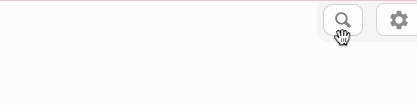
Search Bar and Tools Menu
I moved site search into the upper right. Despite my own proclivity for it being in the menu bar on the left, I know that UX research has shown that people expect it in the top bar, either left or right. So I capitulated.
I also completely redesigned both the search input and the tools menu next to it. They now take up less space while still being available at all times.
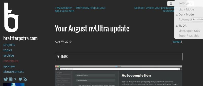
Dark Mode
The site used to have a “high contrast” mode that could be triggered from the tools menu, but I’d never finished it to my satisfaction and had dropped it over a year ago. I finally got around to that, and replaced the menu item with three new ones: Light Mode, Dark Mode, and Automatic. Automatic is the default and will use the OS settings on macOS to determine which mode to show, even switching in real time if you change that setting.
Related Posts
I rewrote the algorithm that determines whether posts are related, reduced the number shown to four, and added thumbnail images as backgrounds for the list.
I have a special Liquid tag that designates an image as the “default” image for the post, but if a post lacks that, it falls back to the first image in the post. If no image is used in the post, it picks from one of 5 default backgrounds (random).
The background images use CSS filter to blur slightly, coming into focus on hover.
The Read More Button
I got a little stupid with this one and added a long, exaggerated expand-and-snap animation to the link that shows up when a post is truncated for the list view. I plan to start using “read more” truncation more often, keeping the home page cleaner. While the animation takes too long, it can be clicked at any time, just like any other button.
TL;DR
I wrote a plugin some time ago that will automatically summarize any post for you. I improved this a bit for this revision. It can be enabled under the tools menu in the upper right, and will only show up if you request it.
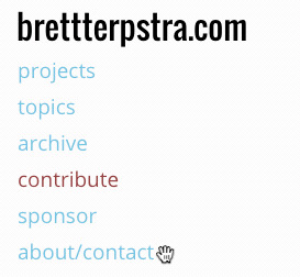
The Sidebar Menu
I re-ordered items in the sidebar menu, and removed some that I didn’t feel were necessary (or often used). I also added a new hover animation using border-radius transitions.
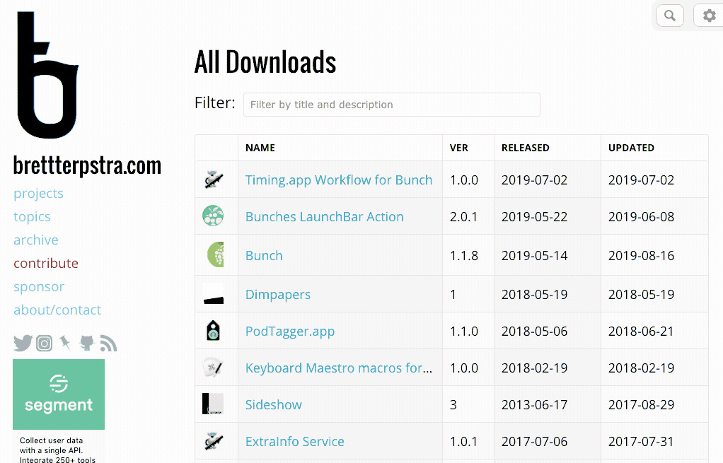
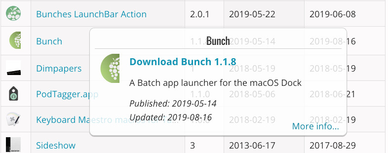
This page now has icons and a responsive table layout, and the table is sortable by clicking column headers (name, date published, date updated). If the screen width is narrow enough that the table starts dropping columns, a sort menu appears to allow sorting by columns you can’t see. Every item can be clicked to reveal its “download card,” with descriptions and a link to the post or project page from which it originated.
There’s also a filter bar that will narrow down the list by finding matches in both the download filename and the file description.
Improved Responsive Layout
I’ve spent a fair amount of time tweaking the layout for mobile devices, given a good portion of my traffic comes from iOS devices. I won’t go into all of the details there, and there are still a few areas I think could be improved, but overall the experience should be seamless for mobile viewing.
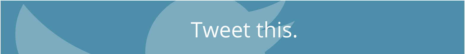
Tweet This
I made a great big Tweet This button with background animation using SVG and CSS animation. I don’t use any “official” social media buttons on this site as I don’t like the user tracking that doing so enables. So the tweet this button has always just linked to a page for creating a new tweet, pasting in the URL and title of the current post. It just looks prettier and is more prominent now.
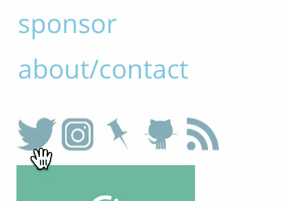
Social Icons
Speaking of social media, I added an icon-based menu of my own social media links to the sidebar. This also exists (and always has) on the contact page, and both versions were completely redone. I used sprites, flexbox, and CSS filters to create a lighter-weight and more and responsive toolbar out of them, with animations starting at a uniform blue that matches the site’s default pop color and transitioning to a service-specific color on hover.
There are a dozen other tiny tweaks to fonts, colors, and overall functionality, but that covers the big ones. I hope they’ve made the site more enjoyable to use, but the ultimate goal is that things “just work.” If you never notice any of this, or more importantly are never bothered by any of it, then I’m happy to have stayed out of your way when viewing the site.
Like I said at the beginning, your feedback is important to me. Don’t hesitate to voice your pain or pleasure regarding any of these decisions.